
If you’ve seen my house, you probably know I have a serious thing for blue. Growing up I was surrounded by a lot of blue and white and while I briefly and maybe subconsciously rebelled in my early 20s with browns, oranges and reds, I keep coming back to blue. Indigo, navy, cobalt, robin’s egg, aqua and all shades in between. I love how blue can be moody and sophisticated, serene and calm or bright and happy depending on its saturation and pairing. And really it almost acts as a neutral with how well it pairs with other colors. A quick look at my Instagram feed and you’ll see it with yellow, coral, pink, red and green. Did I tell you that I have a thing for blue??


But the shade I’m currently coveting is dusty blue. Or slate blue, blue gray, grayish blue, muted blue. Whatever you call it – I’m in love. I used it in a den design for a client last year and there’s a strong bet it will make it’s way into an upcoming project. It looks amazing on cabinetry and trim and I especially love it on an island to breakup an otherwise all white kitchen. The muted blue tone pairs equally well with black and dark woods as it does with lighter woods and warm leathers. Plus, it’s beautiful with polished nickel, bronze or aged brass fixtures. Is there anything this color can’t do??

Gorgeous kitchen by Blackband Design | Photo by Vanessa Lentine
Color is Benjamin Moore Britannia Blue
How perfect is all this blue-gray cabinetry? And those woven leather chairs for that matter?


From left above: Laundry room design by Julie Howard of Timber Trails Development Company via Home Bunch, color is Benjamin Moore Cloudy Sky. Bathroom design by Studio McGee and photo by Lucy Call. Color is Benjamin Moore Polaris Blue. Built-in desk design by Mindy Gayer Design, photo by Lane Dittoe. Color unknown.
Here it’s the perfect complement to beautiful millwork. And I love how the bedroom evokes a moodiness without feeling dark.

Dining room design by Light and Dwell. Photo by Audiss Photo Co. Color is Benjamin Moore Polaris Blue. 
Bedroom design by Alice Lane Interiors. Photo by Lindsay Salazar. Color is custom mix.
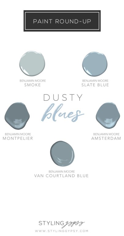
In addition to the colors above, I’ve rounded up some of my favorite dusty blue paint colors – all from Benjamin Moore. Keep in mind, digital colors always look a little different than the real thing and so many factors (light, other colors in the space, etc.) can affect the way a color looks in your room. So I definitely recommend trying out large samples and seeing how the color looks in your room in different areas and at different times of the day before deciding. Enjoy!
This article could have made me blue (🤪) but instead I looked around my home and realized how much I like different shades of blue too!!
🤣🤣 thx emme 😘
Everything in this post is gorgeous. I love the way the blues are being used on the cabinetry. Cannot wait for the upcoming project!
A color can makes its way into a room, but not it’s way into a room. Your blog is beautiful. Just wondering about its grammar. 👌